I finally managed to prepare this review on the phenomenal anime Akira by Katsuhiro Otomo (1988). It’s quite vast and hard topic to investigate, the $9 million cyberpunk film can still rase questions of plot and background lore, also the soundtrack is very unique and can easily be recognised afterwards with the title. As an artist I will try to investigate some visual aspect, scoping very narrow.
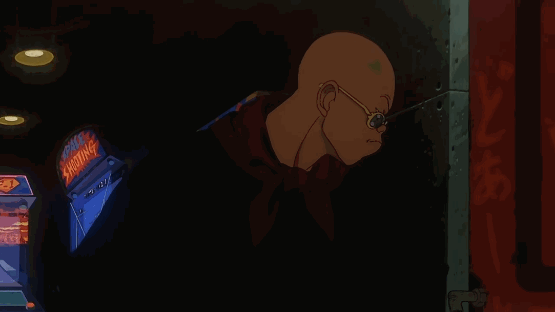
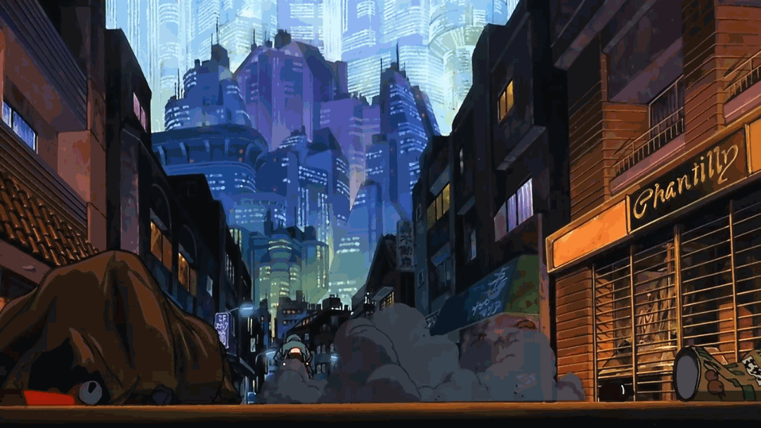
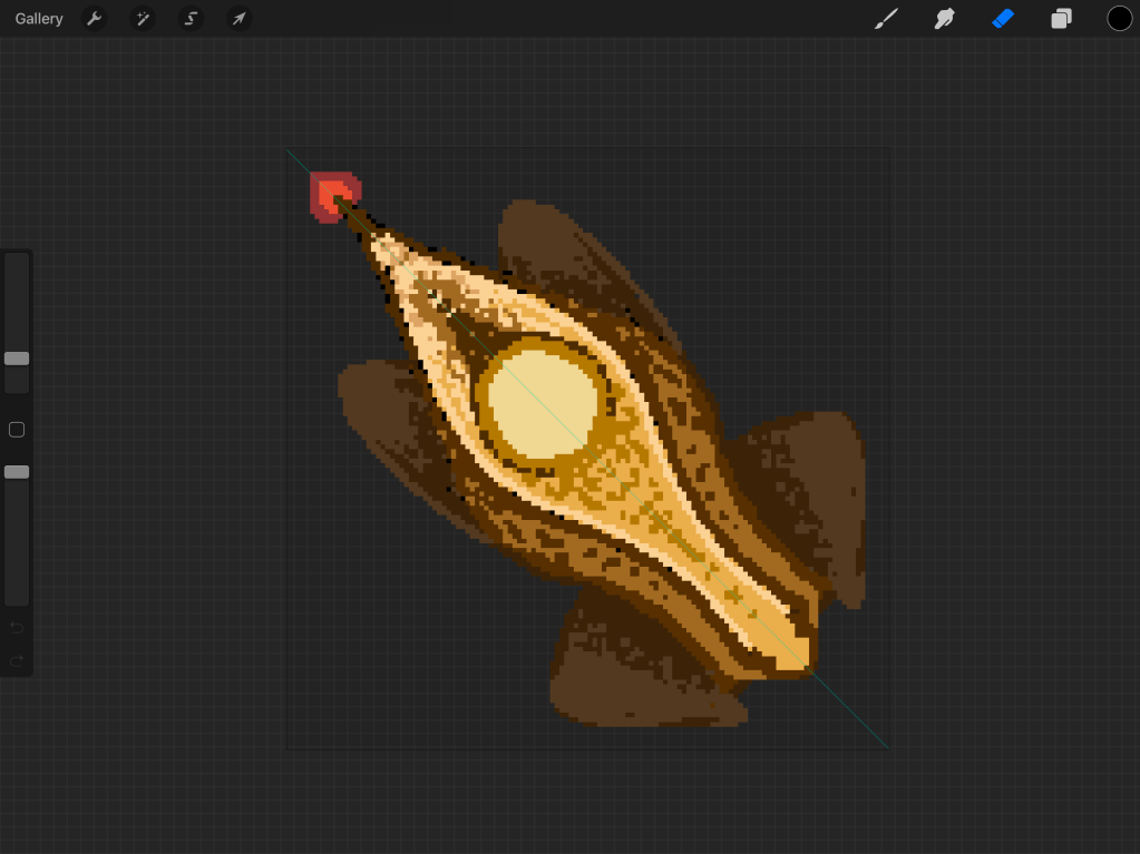
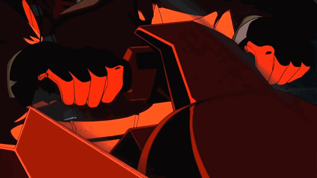
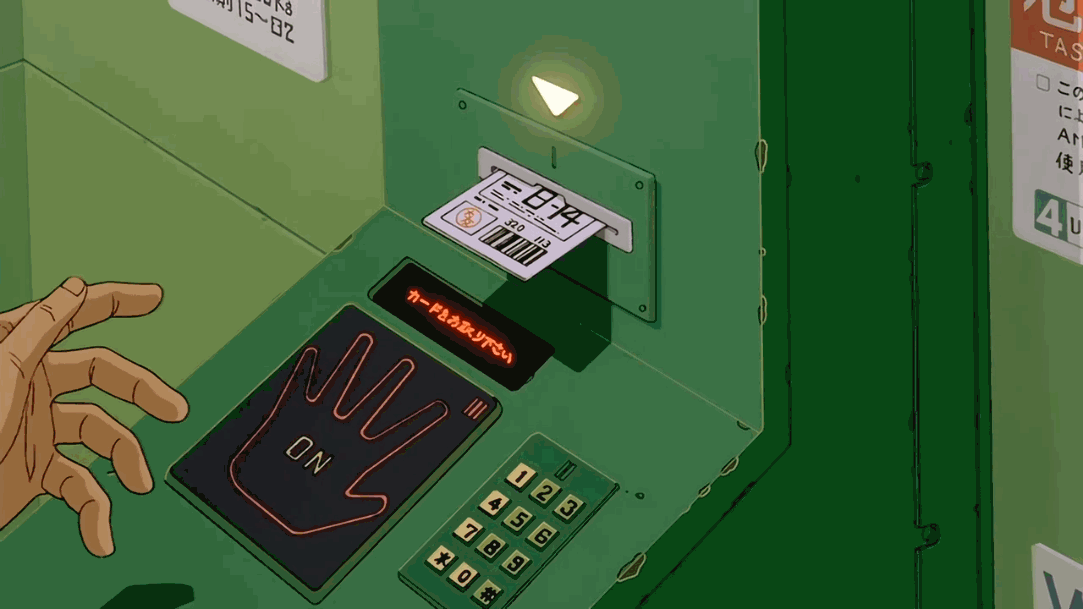
In the above gifs I tried to capture some of the first scenes in the film. Immediately I am overwhelmed by the visuals, the art style is in my face. My attention is drawn by the contrasts in the picture, I can quickly recognise complimentary colours dodging, moving and blending around the screen. A bit forward the contrasts escalate, on the next gif we can see solid saturated complimentary colours used in different ways to enhance the main focus of the scene. The red motorcycle driven by the main character Kaneda sparkles with green lighting, just by buzzing these two colours together drag the attention immediately. In the next shots we see how complimentary colours are used to enhance the camera movement, by creating parallax between the buildings and the streetlights in a tight focal length shot, and then in wide landscape parallax between the layers of buildings.
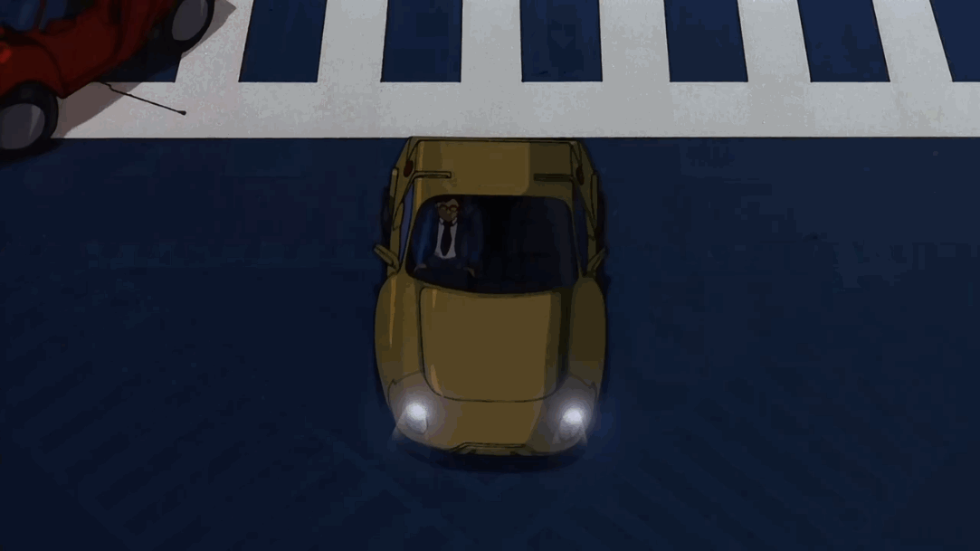
In the next example we see multiple motorcycles passing across the scene, but the attention is driven in the middle of the shot where is a yellow car sticking off the blue street, in this way the passing vehicles seems a lot more blurred, which emphasise the speed.
Next scene we find the main character holding a motivational speech in his red jacket contrasting on the green background, it’s like a portrait scene focused on him.
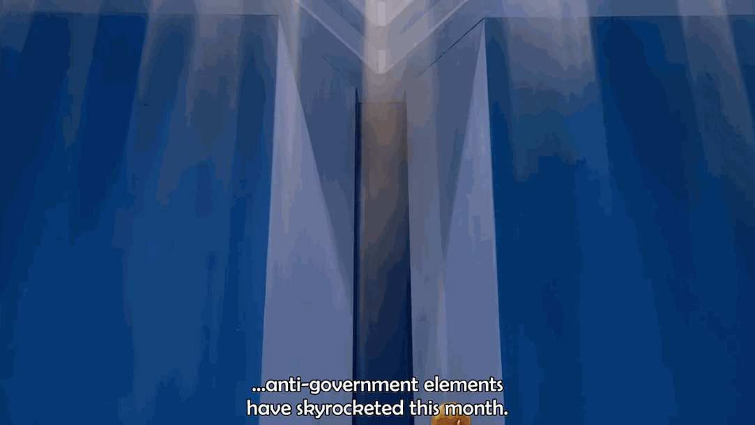
High saturated complimentary colours can tell a story by a simple camera movement from top to bottom. In the next scene we can catch a glimpse of a whole organisation. A golden statue detailing out of a simple blue background with just two brighter stripes telegraphing the camera movement, it feels massive, and carrying a deep meaning. As the camera follows to an oval red table surrounded by green chairs focus immediately to the event.
The next scene is all about the movement, we find a very nice play with objects and their colours. Red doors are opening and flatten into the green walls, and workers in yellow suits approach a corridor with blue stripes on the floor. Like everything snaps together as it’s meant to be.
Playing around with complimentary colours can be a very powerful booster for certain situations, but not a must tool. I share the next shot just because it’s cool.
For this review I drew inspiration from the four basic complimentary colours, as they have been used consistently in the film. This super narrow combination of factors helped me understand more about framing, movement, blocking and meaning behind scene creation. I would always say that any type of limitation can cause a much deeper exploration.
Anyways, Akira is a masterpiece of the genre. It’s super weird, super crazy and beautiful. I hope you managed to reach the end of this post, blessings my friend!